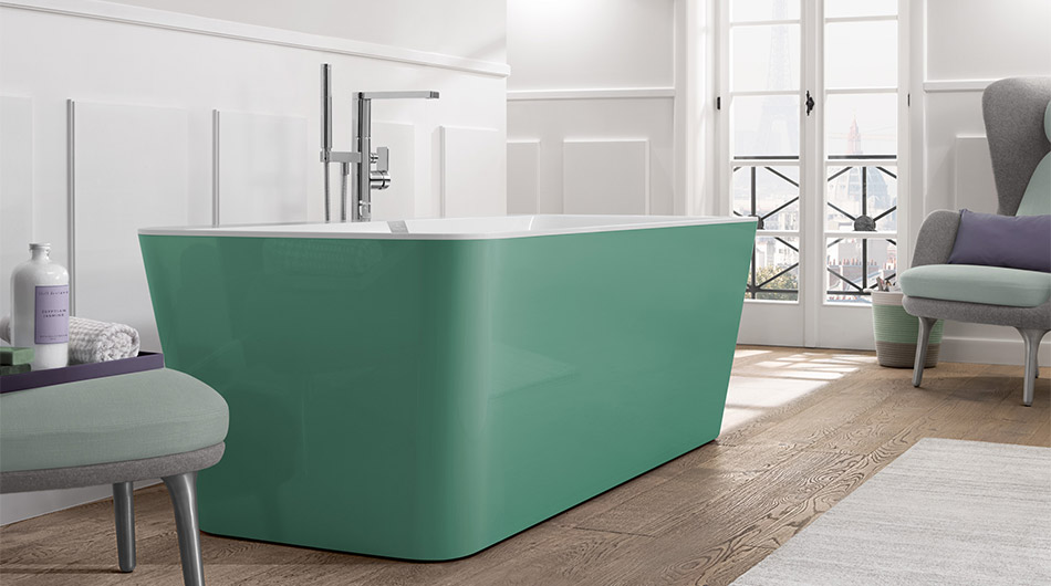
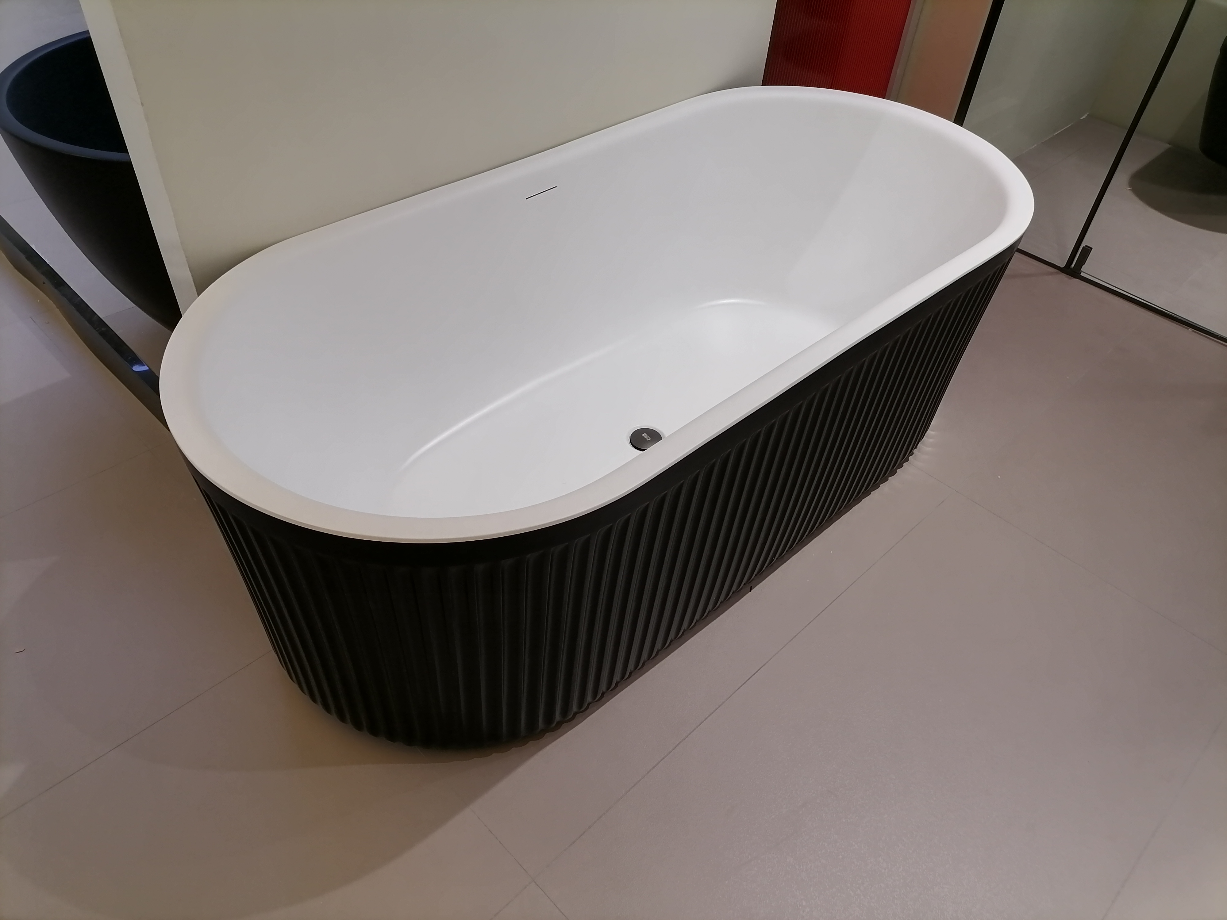
Tepid low-key luxury, moderate, light, soft and elegant, it is not just as simple as eye-catching – the fashion of Morandi color system, next Xiaobian will take you to know what Morandi color system.
Morandi color is named after the Italian painter Giorgio Morandi, who is good at painting still lifes and landscapes, and prefers to use unsaturated colors to achieve a soft effect. His paintings almost never use bright colors, but use seemingly gray and dark midtones to express objects, everything is unassuming, quietly releasing the most simple shock and direct to the heart of happiness and elegance.
He loves the vases, cups and bowls that can be found everywhere in his daily life, and the humble objects are interpreted differently in his writing. His paintings are known for their delicate use of colours, in which he likes to use matte colors, gray, white and other dull colors are often used; The subjects depicted are very simple, mostly with vases, bottles, bowls, flowers and landscapes.
When painting still lifes, Morandi used matte colors, usually in various whites and grays, and occasionally added other equally dull colors. He deliberately uses low-saturation colors to form an introverted painting style, making the subject of the painting more delicate.
Morandi’s color scheme gives a comfortable, idyllic and characterful feeling, so it has always been favored by designers. Morandi color home has an innate soothing, calm, full of tenderness, there is a trace of stubbornness. So, if this high-grade color tone with its own filter effect is applied to the home color matching appropriately, what kind of charm will it reflect?
Editor: Mika
Post time: Jun-24-2023


